About two weeks ago I’ve been asked “I’ve seen some photos when there is blurred like a strip above and below and the middle strip is sharp – any idea how that happens?”
The question came when I posted the following macro on another photography web site:
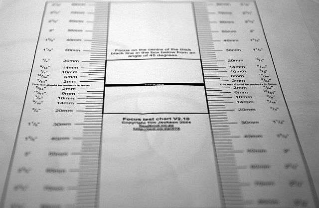
This question reminded me of a focus test chart developed in 2004 by Tim Jackson for his Nikon D70 camera. His research started from various reports from D70 owners that claimed that, particularly when using the kit lens, some of their images are not correctly focused. The problem manifested primarily when shooting close-ups at wide apertures where the DOF is shallower. Tim decided to investigate this further and produced a focus chart downloadable as a PDF document here.
The interesting thing about the focus chart is that the experiment he suggested can also be used for answering the question that I mentioned initially.
As consequence, the answer would be: when using a relatively long focal distance and a large aperture the depth of field (DOF) is very shallow (or very thin). Now imagine a plane parallel with your sensor (or the back of the camera for practical purposes) intersecting the 3D scene you are shooting. Everything on that thin plane will be sharp (the thickness is the DOF – see my posts dedicated to this subject). Everything else will look blurred. The image mentioned in the beginning is a bit more complex and the angle used to take it makes the effect described in the question less obvious.
Here is an example of a DOF test anyone can try. Print Tim’s document and follow his instructions. Now play with different apertures, taking photos for each of them starting from the largest (e.g. F4) to the smallest (e.g. F16) and evaluate the DOF interval in each case. You will notice the effect mentioned in the question at large apertures (like in my image where F2.8 was used).
Have fun experimenting!


