The CIE XYZ color space [1] defines all colors in terms of three imaginary primaries X, Y, and Z based on the human visual system that possess the following properties:
- Based on experimental data of human color matching;
- X, Y, and Z work like additive primaries RGB (every color is expressed as a mixture of X, Y, and Z);
- One of the three values – Y – represents luminance, i.e. the overall brightness (lightness) of the color as a function of wavelength;
- All color values (X and Z) are positive.
The xyY color space is derived directly from XYZ and is used to graph colors in two dimensions independent of lightness. The value Y is identical to the tristimulus value Y (in XYZ). The x and y values are called the chromaticity coordinates of the color and are computed directly from the tristimulus values XYZ. The chromaticity of a color was then specified by the two derived parameters x and y, two of the three normalized values which are functions of all three tristimulus values X, Y, and Z [2]:
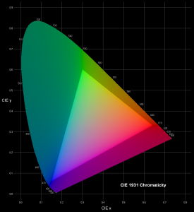
![]() The xyY values of colors can be plotted in a useful graph known as the CIE chromaticity diagram. Colors on the periphery of the diagram are saturated; colors become progressively desaturated and tend towards white somewhere in the middle of the plot. The point at x = y = z = 0.333 represents the white perceived from an equal-energy flat spectrum of radiation.
The xyY values of colors can be plotted in a useful graph known as the CIE chromaticity diagram. Colors on the periphery of the diagram are saturated; colors become progressively desaturated and tend towards white somewhere in the middle of the plot. The point at x = y = z = 0.333 represents the white perceived from an equal-energy flat spectrum of radiation.
For any device such as a monitor or printer, we can plot its gamut – the colors that are reproducible using the device’s primaries [3]. This is one of the most common uses for the CIE diagram. The brighter triangle in the center of the plot shows the colors which can be reproduced by a standard computer screen, representing its gamut. Colors outside the triangle are said to be out-of-gamut for, and cannot be reproduced on, normal display screens. They are artificially desaturated in the plot.
For all its simple derivation from eye-response functions, the 1931 CIE chromaticity diagram is not perceptually uniform because the mathematics of xyY do not model distances between colors. This is the reason why the area of green-turquoise in the large lobe at the top left of the diagram (inaccessible to monitors) appears to be disproportionally large compared with the others. To solve this problem, other color-space coordinate systems and plots were invented – CIELUV [4], CIELAB [5] – in an attempt to be more perceptually-uniform. Their use is fairly specialized.
References:
- CIE 1931 color space on Wikipedia
- Danny Pascale — A Review of RGB Color Spaces … from xyY to R’G’B’
- Color Gamut on Wikipedia
- CIELUV color space on Wikipedia
- CIELAB color space on Wikipedia

